Architecture + interiors
Architecture and interiors website redesign.
A beautiful portfolio can still hide how the practice thinks, what it does best and why a serious client should get in touch.
Request a private review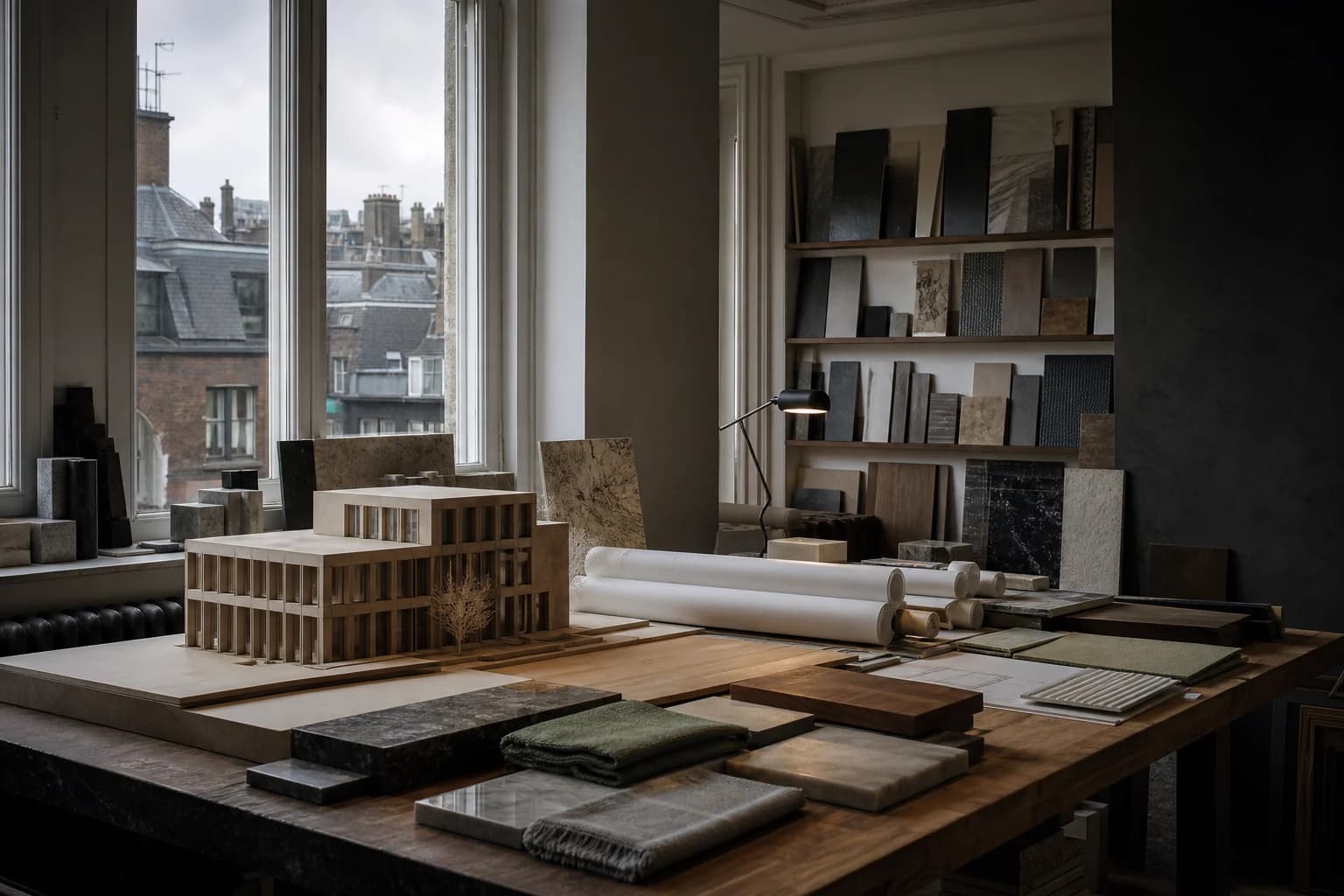
The short answer
Most architecture and interior design websites show beautiful finished work and almost nothing about how the practice thinks, what it is best at, or how a project actually begins. The redesign that wins better commissions makes judgement visible: process, constraints solved, collaboration and the kind of client the practice serves well.
Recognise this?
What usually goes wrong.
If several of these are true, the problem is structural rather than cosmetic.
- A grid of project images with no explanation of the brief, the constraint or the decision that made each one work.
- The practice page describes founding dates and staff numbers rather than a point of view.
- Every project is presented as equally important, so nobody can tell what the practice most wants to be hired for.
- Enquiries arrive from projects far outside the practice's scale, budget or interest.
- Awards and publications are listed but not connected to the work that earned them.
What the redesign changes
Let the thinking meet the work.
We give the work room to breathe while making expertise, project fit and the route to a conversation easy to find.
Show the thinking, not only the photograph
The image proves the outcome. The commission is won by the reasoning: what the site demanded, what the client feared, which constraint produced the idea. Two paragraphs of real thinking beats twenty more images.
Be explicit about fit
Stating the project types, scales and relationships the practice does best attracts fewer and better enquiries. Ambiguity is not modesty; it is a filter that lets the wrong work through.
Give the work room
Editorial pacing, generous scale and disciplined sequencing do more for perceived quality than any amount of interface decoration. The site should feel designed by people who design.
Make the first conversation easy to picture
Prospective clients hesitate because they do not know what engaging an architect involves. Explaining the first stage — what it costs, what it produces, what it commits them to — removes the largest barrier.
No cost, no obligation
Is this your website?
45 minutes with O'Neill on what is holding the current site back, and the findings in writing afterwards — whether or not you go further.
Modern search
How buyers in this sector actually find you.
Clients and AI assistants are asked specific questions: practices experienced with listed buildings, with a particular typology, in a particular region, at a particular budget. Project and expertise pages that answer those honestly are retrievable. An unlabelled image grid is not.
See how search has changedRelated work
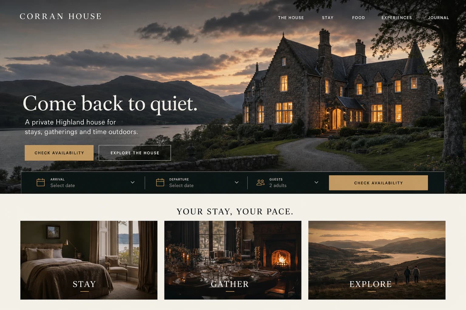
See it applied.
Questions from this sector.
Will a redesign make our work look like everyone else's?
It should do the opposite. The purpose is to build a system specific enough to hold your work and your thinking, rather than a template that flattens every practice into the same grid.
We have limited photography of recent projects. Is that a blocker?
No, but it changes the plan. We identify what is genuinely missing early, and where photography is thin we lean on drawings, models, materials and process — which often communicate the practice better anyway.
Other sectors
Does the business feel more valuable than the website?
Request a private review